"The flame that burns twice as bright burns half as long.”
― Lao Tzu
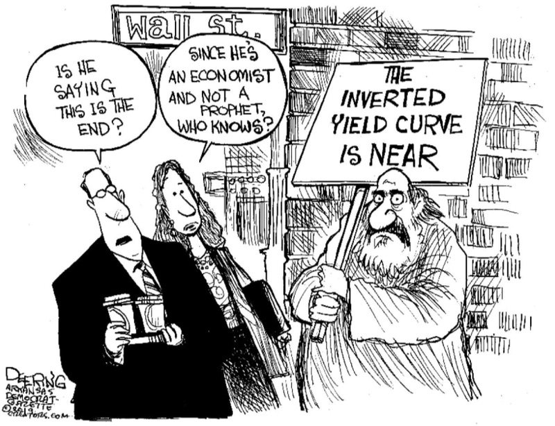
I included this quote because I thought it was a good representation of the current business cycle (at least from the start of COVID to now). Unprecedented stimulus and the uniqueness of the Pandemic have resulted in one of the quickest business cycles, of which we are currently experiencing what Milton Friedman referred to as the “Inflation Hangover.” I know I’m late to the game talking about an inverted yield curve and the effects of rate hikes, and you are probably tired of hearing about the two, but bear with me.
Is The Curve Still Steep?
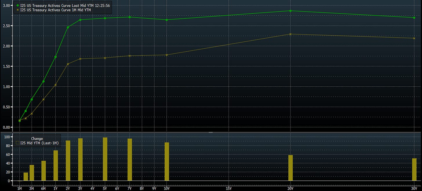
With the extreme tightening of the 2-10 year U.S. Treasury spread in the past six months (eventually inverted in the first week of April but has since bounced back), the flattening of the yield curve has been a center point in financial media. However, what is the predictive power of the sole 2-10 year spread, and why does it look relatively steep when looking at the whole curve?
Fig. 1: U.S. Yield Curve As Of 4/7/22 And 1M Earlier
One spread can’t tell the whole story, but it can be an indicator and lead the rest of the curve. Despite the headlines of inversions indicating recession risk, only 27% of the curve is inverted as of a week ago. This is above the long-run average and is seemingly increasing but still a ways off from the historical choke point of 75%, as shown in Figure 2.
Figure 2: How Much Curve Inversion Is Too Much Inversion?
While most yield curve spreads have seemingly been flattening, the 3 month - 10 year spread has decided to go its own way. In the past, the 3 month - 10 year spread has had the stronger recession predictive power. This has become increasingly important in this lower yield that we have experienced in the past two decades. Due to supply and demand factors, it has been increasingly easier to invert the curve, as massive purchases from quantitative easing (QE) and foreign investors craving risk-free treasuries to park their dollars in have artificially suppressed long-end yields. Looking back at Figure 1, the curve seems to have steepened when considering T-bills (Treasuries with less than 1 year to maturity). Opposers of the inverted curve have increasingly pointed out that since the 3 month - 10 year spread has been increasing, the inversion of the curve doesn’t spell recession. The derivative market is telling a different story however. Forwards are derivative contracts of a certain security for a specified tenor or period in time when the contract expires. In this case, a 1y3m forward would equal the yield on the 3 month U.S. Treasury 1 year out from now. Through forwards, we can see what the market is predicting the 3 month Treasury to be yielding in one year’s time. If one were to look at the spread between the 1 year forward of the 3 month and the 1 year forward of the 10 year (Figure 3), they would see the market pricing in a deep inversion one year out. The reason for this lag is pretty simple: T-Bills like the 3 month are nearsighted and hug the Fed Funds Rate tighter than longer duration Treasuries. Since the Fed has only hiked once, they have lagged the rest of the curve in the mass sell-off.
Figure 3: Two Roads Diverge In A Yellow Wood
Looking at Figure 4, we can see that this is the largest divergence between the 3 month - 10 year and its 1 year forward counterpart in the past two decades as markets price in aggressive rate hikes.
Figure 4: Spread Between 3m-10yr And 1y3m-1y10y
The 3 month Treasury has lagged the rest of the curve but has still sold off. So that leaves only one party to blame for the abrupt bear steepening of the 3 month - 10 year spread, the U.S. 10 year Treasury. The hawkish nature of the Fed, including the plan released in the March Minutes on Wednesday for quantitative tightening (QT) runoff amounting to $60 billion a month starting in May, has resulted in the selling of long-end yields. This can be shown in Figure 5 as the yield on the 10 year has peaked above the two-year two standard deviations trend barrier for the first time since 1999.
Figure 5: U.S. 10yr And Its Two-Year Simple Moving Average +/- Two Standard Deviations
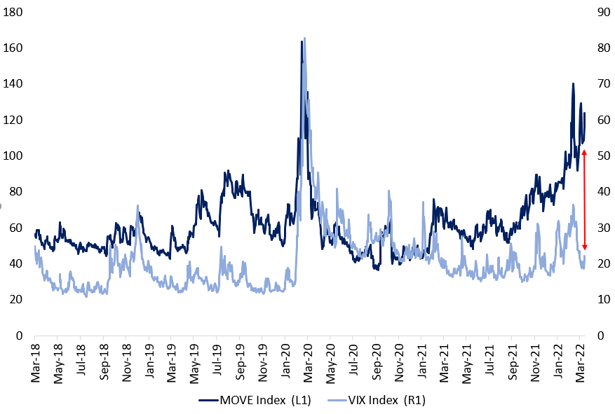
This can be seen in the dramatic increase of the MOVE Index, which measures interest rate volatility. The MOVE Index initially increased due to the Fed’s hawkish shift early this year, then spiked even more from drastic swings in interest rates as investors looked to price in higher rates one day while also driving down yields in a flight to quality the next. After settling for a brief period, investors have reverted to causing a bloodbath of sell-offs in the Treasury and interest rate market as a whole. What’s strange is this increase in bond volatility hasn’t been realized by stocks as the VIX (real-time market index representing the market's expectations for volatility over the coming 30 days) remains relatively calm. With March CPI being released on Tuesday, which is likely to surprise on the upside due to the realized inflation stemming from the impacts of the war in Ukraine, will equities get a shock of reality?
Figure 6: Will VIX Close The Gap With MOVE?
First Domino To Fall
Figure 7: “Star Wars: A New HOPE”
I thought the graphic and acronym above puts an easy visual on the timeliness of the effects of rate hikes. The “H” in HOPE, housing, is starting to show signs of classic behavior from previous hiking cycles. The yield on a 30 year fixed-rate mortgage has sharply surged year-to-date to levels last seen at the peak of the last hiking cycle and even those after the 2008 Global Financial Crisis (GFC). Fortunately, a tiny percentage, ~6%, of homeowners have ARMs (adjustable rate mortgages) compared to levels seen before the GFC, which topped out at 35%. This means that most homeowners aren’t exposed to their mortgage payments rapidly rising from higher interest rates. This is further proof against a housing bubble, or at least to the size seen during the GFC. Not to mention the vast differences: actual incomes that can support monthly payments (“actual” is a loose term as this measure can be partially attributed to more stimulus and record-low borrowing costs), lower speculation in the housing market (ignore companies like Zillow and BlackRock), a lack of lust from banks to package loans, and the genuine undersupply of housing currently. That list could go on and on, but that’s a story for another time.
Figure 8: The 30yr Mortgage Rate Doing Its Best GameStop Impression
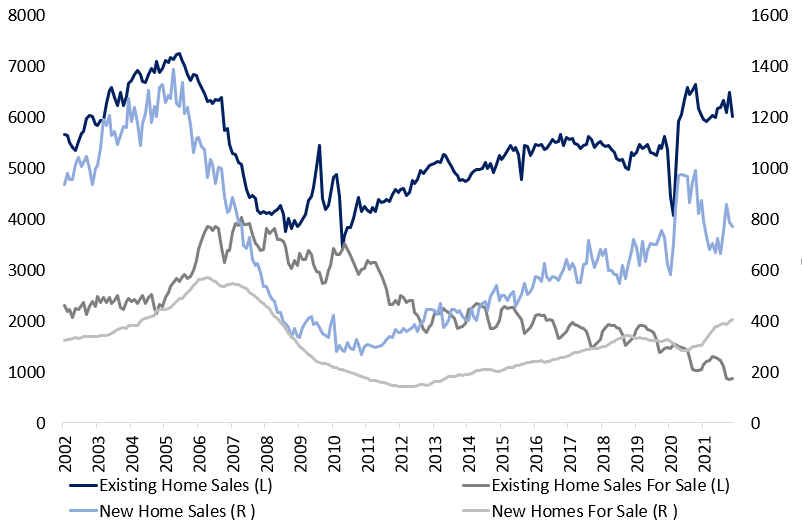
Due to the suddenness of the Fed’s pivot, the housing market (much like the Fed) is behind the historical curve. We are starting to see a rollover in home sales in response to the rapid increase in rates, as shown in Figure 9. We are also seeing that the supply of new homes has been steadily increasing while still lagging behind demand. In addition to this, despite the downtrend in the past decade, we are entering into the cyclical period of the year where there is an increase in existing homes entering the market. This minuscule increase in supply and the higher borrowing cost dampening demand may slightly relieve the housing market. Then again, we’ll see, real yields are still relatively low, and the construction of homes severely diminished post-GFC (also, you can’t make more land unless you’re the Netherlands).
Figure 9: Housing Rolling Over
Higher mortgage rates have not been more evident than in the refinancing market. Homeowners took advantage of low-interest rates and a historically accommodative credit environment by refinancing their mortgages at the lowest mortgage rates ever seen. This has taken a sharp reversal as refinancing moves inversely with mortgage rates.
Figure 10: No more Refinancing
With this rapid increase in rates, mortgage values have declined significantly, with the Bloomberg Mortgage Index crashing to a two-decade low of $95. Not surprisingly, most mortgages in this index are trading well below par, as shown by the green segment in Figure 11.
Figure 11: Mortgages Trading Well Below Par
For a quick, more in-depth look into the housing market, here is the weekly capital markets outlook by Merrill Lynch that highlights the problem in the housing industry and gives a decent outlook.
Conclusion
While this rate cycle is genuinely unique in many aspects, history still rhymes. After two years of credit binging, the U.S. economy is experiencing what Friedman described as an “inflation hangover.” The signs of a classic tightening cycle (spoiler, they usually don’t end well) are starting to show with the wobbling of the first domino, housing. This cycle has had a faster pace and more complexity than previous ones when considering COVID-19 and the war in Ukraine. The question becomes: can Powell and the FOMC slam on the breaks without crashing the car to achieve the ever rare “soft-landing,” or will he roll the car into the wall leaving us in a stagflation environment?


